Control Helper
The Control Helper is a powerful rigging tool that offers users a range of options to customize helper objects. Designed especially for rigging, it provides users with a variety of helper objects that can be tailored to their needs. It also includes a selector feature, which enables users to use other object's faces for selection, making rigging more intuitive and efficient.
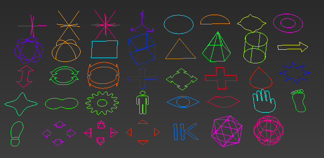
One of the key features of the Control Helper is the variety of display types it offers. The tool includes a long list of options, such as Cross, Circle, Box, Arrow, Star, and more. Each display type has unique properties that can be adjusted using the parameters available in the Control Helper. This makes it easy for users to create custom helper objects that fit their specific rigging needs.
From simple shapes like circles and rectangles to more complex designs like cones and gears, the Control Helper provides users with a diverse range of display types to choose from. Some display types, such as the Eye, Lips, Hand, Foot, and Shoe, are even specifically designed to work with character rigs. With options such as Arrows, Pyramids, and Triangles, users can create helpers that indicate the direction or orientation of an object. Overall, the Control Helper's wide variety of display types is an important feature that allows users to create customized helper objects that meet their unique rigging needs.
Creation Method
 Create panel >
  (Helpers) > Standard > Object Type rollout > Control Helper button
Click on the viewport to define the control helper position. You can access its parameters in the Modify panel.
Parameters
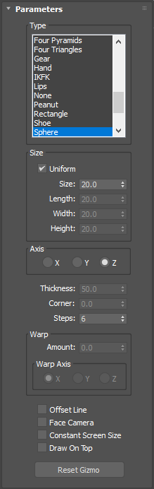
Type
In this list you can select the display type of the control helper. The following types are currently available:
Arrow
Arrow Circle
Arrow Cross
Arrow Cylinder
Arrow Double
Arrow Mixed
AxisTripod
Box
Character
Circle
Circle Half
Circle Pointy
Cone
Cross
Cross Asterisk
Cross Diagonal
Cross Flat
Cylinder
Donut
Drop
Eye
Face
Foot
Four Arrows
Four Pyramids
Four Triangles
Gear
Hand
IKFK
Lips
None
Nose
Peanut
Rectangle
Shoe
Sphere
Sphere Geo
Sphere Hemi
Sphere Icosa
Star
Star Smooth
Triangle
Size Group
Uniform: If this parameter is On, the size of the helper will be controlled only by the individual Size parameter. If the parameter is Off, the size will be controlled by the Length, Width and Height parameters.
Size, Length, Width, Height: These parameters are used to control the size of the control helper. The Size parameter will be used if the Uniform parameter is ON, the Length, Width, and Height parameters will be used if the Uniform parameter is OFF.
Axis
This controls the orientation axis of the control helper.
Corner and Thickness
These parameters are used by some types of the control helper.
Steps
These are the steps of the interpolation in the lines of the control helper.
Warp Group
Here you can define how much the control helper is warped and the axis where the control helper will be warped. These parameters are only available in some types of the control helper.
Offset Line
If this parameter is ON, a line will be displayed between the position of the node and the gizmo offset position.
Face Camera
If this parameter is ON, the control helper will always be facing the camera.
Constant Screen Size
Maintains the size of the control helper constant, irrespective of the zoom level.
Draw On Top
When enabled, the control helper renders lines above other objects by disabling Z-buffer depth testing.
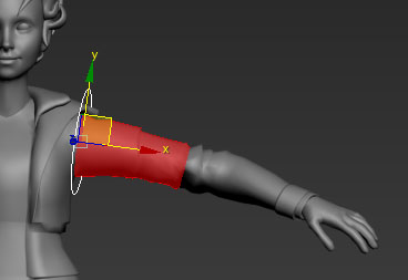
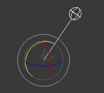
Gizmo
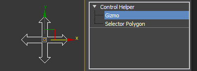
The Control Helper's gizmo can be used to create an offset transformation in order to make specific adjustments to the helpers display. You can access the gizmo as a sub-object in the modifiers list.
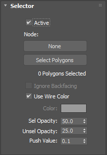
Selector
Active
Enables/Disables the selector. With the selector you can use other object's faces to select this helper.
Node Button
With this button you can select the object that is used for the selector.
Select Polygons
When pressing this button you can select the object's faces that will be displayed for aiding selection.
Ignore backfacing
When this parameter is ON, the backfacing faces of the selector object will be ignored while selecting.
Use Wire Color
When this parameter is ON, the selector faces will be displayed with the same color of the selector object's wireframe.
Color
This color will be used to display the selector faces if the parameter "Use Wire Color" is OFF.
Sel Opacity
This parameter controls the opacity of the selector faces when the control helper is selected.
Unsel Opacity
This parameter controls the opacity of the selector faces when the control helper is Not selected.
Push Value
Adjusts the distance of the selector faces to prevent overlapping with the original object's faces.